Fantastic visions and unknown worlds: Van Der Graaf Generator’s sleeve art
May 2021

Savage Pencil's illustration for Mike Barnes's Van Der Graaf Generator Primer. See page 36 of The Wire 448.


As a complement to the cover story of The Wire 448, a two-part special on Van Der Graaf Generator, Edwin Pouncey surveys the surreal designs that adorned the covers of the early albums by the UK art rock outliers and their singer Peter Hammill
In keeping with their proto-steampunk group name, the cover artwork of Van Der Graaf Generator has always been subliminally linked with the kind of fantastic visions and unknown worlds that primarily exist within the pages of pulp science fiction. Hawkwind are another group from the same era, whose cosmic quest led to the birth of space rock (with designer Barney Bubbles as their artistic engineer). But the art of VDGG has a darker and more mysterious painterly quality to it that is reminiscent of the covers for 1960s and 70s paperbacks by science fiction authors such as Brian Aldiss, Samuel R Delaney and Frederik Pohl.
In the same way that these interplanetary images were attempting to give the reader an idea of the storyline inside, VDGG’s album art was loosely intended to complement the songs on the record without being unduly intrusive on the listener’s appreciation of the music or interpretation of the lyrics. The 70s progressive rock scene demanded spectacle – this was music for the post-Beatles generation, and a new dawn of experimentation within art and music had broken. Gatefold covers were de rigueur and it was important to find a designer and image that would eclipse the competition. While VDGG took off somewhat shakily with a rejected cover idea and a misjudged US record deal, by the time they had signed to Tony Stratton-Smith’s Charisma label the group’s collective vision was infinitely more focussed and unique.
Van Der Graaf Generator
The Aerosol Grey Machine
(Mercury/Esoteric) 1969/2019
Cover concept by Peter Hammill, photography by Gordian Troeller/John Goodman/John Clamp

From left: The Aerosol Grey Machine Mercury 1969 edition; Esoteric 2019 edition. Cover concept by Peter Hammill, photography by Gordian Troeller/John Goodman/John Clamp
Initially issued by Mercury as a US only release, VDGG’s debut album was fraught with corporate misunderstanding and interference.
The original concept, envisioned by Peter Hammill, was to package the album in a gatefold cover adorned with a colour photograph of a Carnaby Street attired girl spraying a stylised jet of grey shaded mist from a monochrome aerosol can. This psychedelic cloud drifted over to the back cover and leaked into the inner gatefold where individual photos of the various group members were included as part of the overall design. But US Mercury were not impressed and reduced the gatefold to a single sleeve. Further changes included significantly altering the colour scheme, cramming the group images together, and dominating the cover with a warped photo of an Op Art labelled spray can. This clumsy distortion unfortunately became the standard cover for the album as it is known today. Although printers’ proofs were made for the rejected UK edition, it would only be officially released half a century later as part of Esoteric’s 50th anniversary box set of the album.
Van Der Graaf Generator
The Least We Can Do Is Wave To Each Other
(Charisma) 1970
Design by CCS Advertising Associates Ltd/Jim Fynn/Van Der Graaf Generator

The Least We Can Do Is Wave To Each Other (Charisma) 1970. Design by CCS Advertising Associates Ltd/Jim Fynn/Van Der Graaf Generator
Now signed to Tony Stratton-Smith’s newly formed Charisma label, VDGG were given the freedom they craved, together with more control as to how they were being graphically represented. The Least We Can Do Is Wave To Each Other was their first major release, with songs like “Darkness”, “White Hammer” and “Refugees” showcasing a massive musical progression from their previous album.
For this important release a gatefold cover was needed and so the job was farmed out to CCS, a London based design team who produced album cover artwork for, among others, reggae label Trojan Records. Out of all the covers from the group’s discography, the artwork spread for TLWCDIWTEO is the most dramatic, with its apocalyptic storm tossed sea and the group depicted clustered together on a precarious looking log raft. Behind them a dead sun sets over a painted horizon, connected to an electrified umbilical cord, blasting from the chromed orb of an actual Van de Graaff generator that is rising out of the ocean like the periscope of an alien craft. The lightning bolt theme continues on a lurid double-sided poster of lyrics and notes that came with early copies of the album.
As with The Aerosol Grey Machine, the group’s then US label Probe/ABC decided that the original cover was too costly (and probably too weird) to reproduce Stateside. The gatefold design was again shrunk to a single pocket cover and the artwork was completely overhauled, this time by William Shepard, whose more sympathetic treatment – of having the group’s disembodied heads floating in space – was more in keeping with the strong science fiction influence that pulsed through the record.
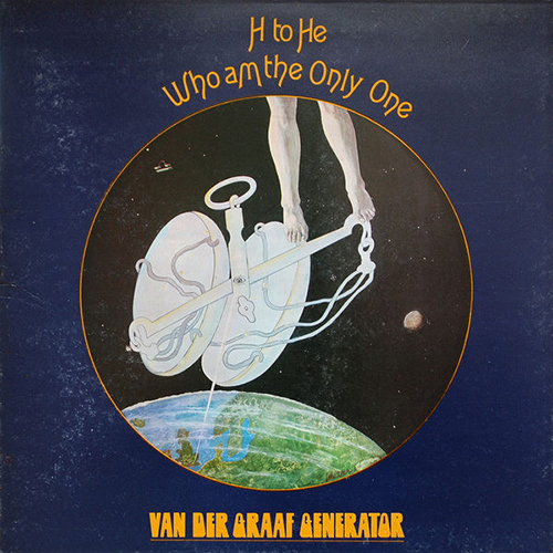
Van Der Graaf Generator
H To He Who Am The Only One
(Charisma) 1970
Design by Paul Whitehead
H To He Who Am The Only One (Charisma) 1970. Design by Paul Whitehead
The sci-fi theme continued apace on the cover painting for this, the group’s third album. The artist responsible was Paul Whitehead whose Cleen Mashine Studio would become an important factor in the development of Van Der Graaf Generator’s cosmically charged visuals.
Whitehead’s original suggestion for the cover had been a painting of a burning outstretched hand, set in front of a celestial background and bordered by a checkered pattern that has been invaded by a multi-coloured laser beam. Eventually dismissed by the group, it was replaced by Birthday, an even stranger work that could be read as a depiction of how human beings interact with science, the cosmos and the supernatural to become a single cosmic force. Whitehead revealed that the inspiration for the painting was linked to his birth sign Libra, but even with this knowledge, it remains an unforgettable image with a spectral otherworldly presence.
Van Der Graaf Generator
Pawn Hearts
(Charisma) 1971
Design by Cleen Mashine Studio/Paul Whitehead, photography by Keith Morris

Pawn Hearts (Charisma) 1971. Design by Cleen Mashine Studio/Paul Whitehead, photography by Keith Morris
Partly inspired by the song “A Plague Of Lighthouse Keepers” that is the centrepiece of VDGG’s epochal fourth album, Whitehead created a suitably widescreen design for the cover.
Taking his cue from a conversation with Peter Hammill about the overall concept of the album – where no matter if you were a king or a pauper you were still a pawn in the cosmic game – Whitehead constructed a grandiose painted collage made up of various figures from all walks of life, each encased within the shape of a chess pawn. To this was added a backdrop of a giant celestial theatre curtain with planet Earth as the stage over which his collected ensemble hovered midair.
Even more mind blowing, however, was Keith Morris’s controversial infrared photo that flooded the entire inner spread of the gatefold cover. It was shot in the grounds of label boss Stratton-Smith’s country retreat Luxford House in Crowborough, Surrey while the group were engaged in a game of Crowborough tennis (an absurd VDGG-invented game with rules that vaguely resembled those of lawn tennis, only using a football and a garden table). During the photo session the group naively decided it would be a lark to throw Monty Python-styled Nazi salutes (while precariously balancing on said garden table) at saxophone player David Jackson, who was goose stepping across the turf, plastic football under arm, looking like some Mosleyite referee.
This photo (which was used for both the album and the picture sleeve for the “Theme One” single) is both undeniably sinister and staggeringly surreal. As organist Hugh Banton later admitted in Van Der Graaf Generator: The Book, “You just wouldn’t get away with this nowadays, but I think the unfathomability was the attraction! Like, how bizarre can we make this?”
Peter Hammill
Fool’s Mate
(Charisma) 1971
Design by Cleen Mashine Studio/Paul Whitehead, photography by Sebastian Rich

Fool’s Mate (Charisma) 1971. Design by Cleen Mashine Studio/Paul Whitehead, photography by Sebastian Rich
As well as VDGG, Whitehead was also responsible for designing album covers for other Charisma artists such as Genesis, Lindisfarne and VDGG singer Peter Hammill whose solo career was launched on the label. For Hammill’s debut Fool’s Mate Whitehead produced a painting that was a more playful take on the canvas he had created for Pawn Hearts. Taking elements from the album’s songs and suggestions from various group members (with Hammill’s decoding of the chess move fool’s mate being the main influence), Whitehead’s cosmic chessboard is surrounded by a maze of different landscapes, seascapes, distant horizons and inner portals. The title of the album trails behind a biplane on a windsock, while Hammill peers from inside a crater situated next to a gigantic bathroom plug. A surfeit of garden gnomes, domineering chess pieces, lost toys and Lowryesque figures add to the almost nursery themed aspect of the piece.
According to Whitehead the artwork was nearly lost en route to the printers after he failed to tie it to the roof of his car securely. It flew off in transit and landed face down in the road where it was run over by passing traffic. Mercifully the main painting was unscathed, although a suggestion was jokingly made at the time that the tyre-tracked side should also be incorporated as part of the final cover. This idea was quickly abandoned, however, and Sebastian Rich’s Renaissance-styled photographic portrait of Hammill leaning into his grand piano was used instead.
Peter Hammill
Chameleon In The Shadow Of The Night
(Charisma) 1973
Design by Paul Whitehead, photography by Bettina Hohls, Gordian Troeller
Peter Hammill
The Silent Corner And The Empty Stage
(Charisma) 1974
Design by Bettina Hohls

From left: Chameleon In The Shadow Of The Night (Charisma) 1973. Design by Paul Whitehead, photography by Bettina Hohls, Gordian Troeller; The Silent Corner And The Empty Stage (Charisma) 1974. Design by Bettina Hohls
In the same way that VDGG’s The Least We Can Do Is Wave To Each Other was widely considered their first proper album, Chameleon In The Shadow Of The Night is technically the first real Peter Hammill solo album, in that he wrote all the songs and is solely responsible for the production. For the front cover German artist/designer Bettina Hohls provided a suitably obscure photographic image titled Hamburg Foliage showing Hammill strumming his acoustic guitar in a hedge. To this was added a circular frame adorned by Paul Whitehead’s PH logo and a poisonous looking black scorpion. The combination of these elements produced a strikingly intriguing visual that had the look of something that might have appeared on a kosmische musik release.
This approach was taken further by Hohls on Hammill’s next solo release The Silent Corner And The Empty Stage, where she was responsible for the complete design of the gatefold cover. Here, an abstracted eroticism engulfs the front and back covers, with Hohls’s cosmically charged photo of Hammill in the rain being birthed from an alien orifice. Her painting for the inner gatefold is equally sensual and unsettling, where soft fleshy forms collide with some kind of hard-edged mechanical biology that has flashes of a cross-pollination between Claes Oldenberg and HR Giger.
Prior to this work Hohls was a member of Ash Ra Tempel where she was a vocalist on the group’s Seven Up album with Timothy Leary. That album’s cover artist was musician Walter Wegmüller, and although not intentional, there are distinct similarities between the two separately created covers that cannot be totally ignored.
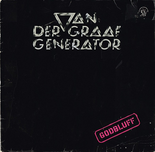
Van Der Graaf Generator
Godbluff
(Charisma) 1975
Design by John Pasche
Godbluff (Charisma) 1975. Design by John Pasche
Three years after they split, VDGG returned to the studio to produce their fifth album. The cover for Godbluff eschewed all pretensions to prog rock imagery in favour of a more minimalist approach.
Artist John Pasche, who was also responsible for The Rolling Stones’ tongue and lips logo, painted the sleeve of Godbluff black with just his newly designed band logo and a rubber stamped album title. This gives the album the look of an official bootleg, while at the same time being the complete opposite of previous VDGG covers. Like his Rolling Stones logo, Pasche wanted to give the group an immediately recognisable identity wherever it was placed. Here the electrified metallic orb that dominated the cover of their second album is distilled into an inverted chrome triangle to form the V of the group’s name. It’s a simple yet effective graphic device that served them well and propelled them into a different direction. From now on there would be no more elaborate and fantastic cover paintings, as VDGG prepared themselves for the onslaught of punk and a more technologically streamed future.
The cover story of The Wire 448 is a two-part special on Van Der Graaf Generator, including new interviews with the group members by Emily Bick, and a Primer by Mike Barnes. Subscribers to The Wire can also read the articles online via the digital archive.
Comments
Brilliant article, thanks! Btw, am I the only one who loves the psych-tastic cover of AGM (with the bendy aerosol can)? It just screams late 60s psychedelic to me, I love it! Also, glad to see HB's quote utilized, the one he gave me for The Book. Finally, I've always loved the John Pasche "Escher" logo. It's perfect. I asked John about that back in 2010 via email: "I can’t recall too many details about the VdGG work as it is going back quite a few years now. I was always a great fan of Escher and that was the starting point for the logo. I think I met up with Peter Hammill just the once to discuss some artwork over a joint or two but other than that did not hang out with the band at all. Sorry that I cannot supply a few anecdotes for you but that’s about all I can remember."
Jim Christopulos, co-author "Van der Graaf Generator - The Book"
Jim Christopulos
Fascinating stuff, much of which I knew little of. It would be great to expand to cover the rest of the Hammill/VdGG canon. Nadir's Big Chance has always intrigued me as most of them have to be honest. These works would have had much less impact if produced on a CD. Gate-fold 'proper' albums are the only way to present this kind of artwork to show it's true beauty. Great article - many thanks.
Carl
Great article of a very fine band that encompass the true spirit of Prog Rock - born from th musical renaissance created around the void left by the Beatles brake up. Pawn Hearts and Fools Mate cover design by Paul Whitehead reflected that time in the London music and art world. Pawn Hearts topped the charts in Italy in early 1972 and the band found it difficult to deal with that unexpected fame and success. Peter hammill decided to split the band up and retired in the country where he recorded Chameleon in The Shadow of the Night in a 4 track machine... The Italian album cover came out with the translation of PH lyrics.
Armando Gallo
Yes, great article. Well done, Edwin. Most enjoyable. There is obviously huge potential to expand the article, firstly into the whole VdGG and Hammill canon to include not just covers but also the interior design of the gatefold sleeves (which were referenced but sadly not included above). Then there are the lyric sheet inserts that came with each of the albums except 'Nadir's Last Chance' - 'The songs don' suit' (sic).
Indeed, thinking of the vast and awesome array of albums created by Mr. Hammill, there is definitely the potential for a 12" by 12" 'coffee table' compilation of said album covers, interiors, and lyric sheets which Edwin might consider as his next project (just a few dedicated years of your life, Edwin!). As Carl wrote above, 'the size of the original gatefold albums is the only way to present this kind of artwork to show its true beauty'. Sounds like a crowdfunding project.
Equally, although all PJAH's song lyrics have been compiled on the SofaSound website, what a dream it would be to have a book compilation of all of the lyrics. There are, of course, the early lyric collections contained within the two volumes, 'Killers, Angels, Refugees' and 'Mirrors, Dreams, and Miracles' but there's such a lot beyond those! Those of you who are familiar with the www.peterhammill.com site might agree that Adrian, who runs the site (an amazing place that you should visit if you've not done so already!), should be charged with the project. Anther mega crowdfunder!
Great stuff! Keep it up, chaps!
Frank Driessen
Excellent.Book would be great.
William B Canty
Leave a comment